Special Interview with Range Murata
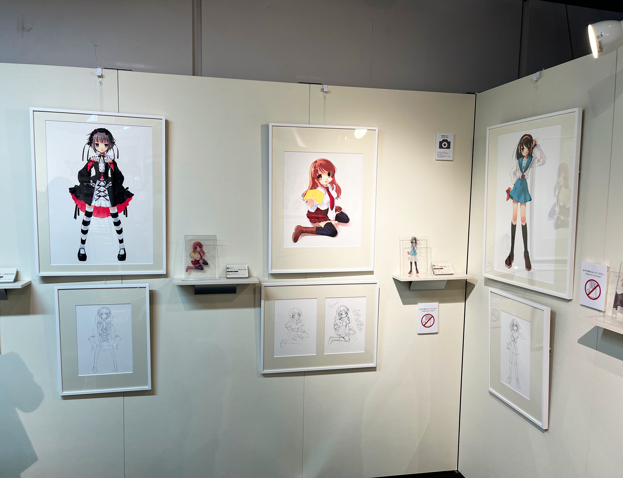
To commemorate the release of art prints, we asked Murata-san to talk about the creative process of his illustrations.
--When did you establish your current style of drawing?
Renji “Range” Murata: Probably around 1995, when I began drawing in color.
Before that, I drew in monochrome using screen tone paper often used when creating manga.
Screen tone paper is actually very limiting. You can only do so much gradation, especially because screen tone paper is in black and white and has nothing to do with hues.
Once I started drawing in color, I realized the potential and kept drawing more. That’s how my style came about.
--What’s your favorite type of product design? For example, you have a Volkswagen Bus; is that a favorite?
Murata: It’s not the country it’s from, but the shape of the item that grabs me. Of course, I love the VW Bus, but there are old Japanese, French, or American cars that I like too. They tend to be a little roly-poly, maybe retro. I don’t know why I like old things... I always did, even when I was young, but I still don’t know why. Perhaps it’s because old things can be timeless. They don’t become old-fashioned for me. Maybe that’s the reason.
I’m also wild about metal textures, so I collect ZERO Halliburton travel cases from the 1950s. At a glance, these look like plain, smooth, silver-colored boxes. Still, if you look closely, metalwork precision or the surface finish can be slightly different according to when it was made, and that’s intriguing.


On the other hand, I’m not into decorations that much.
In Europe, there are amazing Gothic architectures like cathedrals, but every flat surface is ornamented. There would be faces of humans or angels even in the smallest space, and I find that jarring, to be honest with you. Of course, these buildings are palatial but there’s too much going on, making me uneasy.
I prefer a cleaner look. When I was young, modern architectural styles such as Bauhaus left a strong impression, and it’s still my favorite.
Bauhaus is all about streamlining designs, so I guess that’s the camp I’m in.
--When I saw your art for the first time, I thought it was straightforward yet evoked texture.
Murata: Right; function-focused without the decorations.
I do like decorations as long as they’re not too much.
For example, I really appreciate how understated decorations are in the Art Deco style.
Two years ago, I went to the Chrysler Building in New York, and it blew me away. The building was always my most favorite, so I felt “Finally! I made it here!!”
--Please tell us about when you began using digital. Were you forced to switch from analog to digital, or was it a deliberate choice?
Murata: I’m a bit of an anomaly; I was already using digital when I was working at a video game company, and my drawings took after those who were using digital.
Around the year 2000, I was living in Osaka, and was asked to do character design work for the anime Last Exile which was being made in Tokyo. Once I started, I realized there were many more characters than I expected.
Thinking about it now, I should have delegated the design work for characters who didn’t have a name or any lines, but I kept designing them myself.
The problem was that I’m not that speedy. I also had other illustration work on a monthly commitment, so I couldn’t concentrate only on Last Exile every day.
As I fell behind, the studio’s reminders became loud demands, so I decided to hunker down on Last Exile by physically working at their studio. It was supposed to be for about a week, but I couldn’t finish even after a month. A month became two, but there was just so much work I needed to do that I couldn’t return to Osaka.
When I went to the anime studio, I realized that character design was necessary for everyone working in subsequent development stages. Of course!
The person who had to complete his work at the first step, me, had a deadline that affected everybody. So, if I took a day off to go back to Osaka, I would then delay every subsequent step by a day.
As I scrambled, I had my other illustration work and analog drawings from home that I needed to color. I didn’t bring my set of color markers from Osaka, so I decided to buy a Mac to do the work at the Tokyo studio. The studio in Tokyo, being an anime one, had a person who was very good with Macs. This person taught me how, and I began using digital tools for my art.
By the way, even after I bought the Mac, I still couldn’t go home to Osaka for about a year.

--I’d like to ask about your illustration process. You used to draw rough sketches on paper, didn’t you?
Murata: Yes, when I was only using analog methods, I would draft, clean it up, take a black and white copy, then color it with color markers. After I began working with digital tools, I would draft, clean it up, then digitally process it.
--Do you have your own rules in coloring, such as starting from dark shades or vice versa?
Murata: Not anymore, with digital.
There were rules when I did analog drawings, such as starting with lighter colors.
I’m glad those went away with digital tools. I could start with any color, and I can always go back if I go beyond the lines.
With color markers, you don’t want to go beyond the lines, so I would carefully color up to the line, calculating how the colors slowly bleed into the line by osmosis. So, a drawing usually has separate parts, like hair or skin. Let’s say a character has dark hair. You start with the skin because the color is light; that’s the easy part. But if you color the tips of the hair the wrong way, that hair color could also land on the skin.
There were lots of techniques, like trying different alcohol levels at the tip of the color markers.
--Tell us about your expressions in digital and analog. For example, when you started doing drafts in digital, has it changed your work?
Murata: With paper, I would lay it down flat on a desk, but with digital, I have the screen on a slant like on an easel.
The difference is, I use my elbow and up in digital, while in analog, my fingers are doing the work.
Fingertips are absolutely better for creating fine details, so I was able to create precise, accurate lines when I was working on paper.
On the other hand, digital tools let you magnify, so even if you got something a little wrong, you can magnify the work and erase it easily.
If I had to choose, though, I think I was probably faster in analog.
I’ve been using digital for almost 20 years now. The other day I toyed around with my friend’s iPad, and I am now warming to the idea of drafting on iPads.

--Beyond your comfort with digital tools, I wondered if digital tools helped you create a new approach.
Murata: I used to use color markers when working in analog, which have a limited number of shades. My go-to brand was Pantone Markers, which has about 300 colors. Then Copic Markers emerged, with about 200 colors at the time. Still, there were some insufficiencies, but all in all, markers only had about 500 shades.
With color markers, I spent a lot of energy getting the right color under this limitation. You couldn’t always mix colors because... for example, alcohol-based inks can decompose and change shades or separate after drying. Or two shades can be similar but should not be mixed. However, digital has bazillions of colors that I could use and mix. Digital has absolutely no limits on what I can do with colors.
So, I was glad digital liberated me from worrying about colors.
When I started working with digital, I needed to get used to the tools and there were some hiccups, but I began to enjoy it once I realized digital would let me work with very precise colors, or precise color gradations.

--Last question: do you have a favorite color tone?
Murata: I guess that would depend on the drawing, but I don’t often use neon colors. Most of my work does not have bright or saturated colors, so I guess I like muted colors.
--We create giclée prints of your work, and we found that limiting the color gamut helps us recreate colors that win your approval.
Murata: I think giclée’s final opportunity is the color black. Giclee’s black tends to be like the darkest color displayed on an LCD screen or a TV monitor, more of a dark gray.
So even if people from the printers tell me they got the black right, I’d be like “Ummm, that’s not black?”
When you draw by hand and use gloss ink, you get an inky, pitch-black finish. That’s what I’m looking for.
--You got it! We will continue our work to get the black finish that would make you happy, Murata san.
Thank you for taking the time from your busy schedule.

(Location: Murata-san's home)
See Range Murata art print collection


